Beyond the Mark: How We Approached Conduct's Logo Design

The Shape of Meaning: Designing a Logo That Thinks
Designing a logo is one of the most misunderstood parts of the creative process. To the untrained eye, it’s a simple mark. To a designer, it’s the visible tip of a deep structure of thought, restraint, and understanding. A logo is the smallest container for a company’s soul — a distillation of everything it stands for, reduced to form, proportion, and intent.
When a designer begins the process, they don’t start by sketching shapes. They start by listening. To the founder, the product, the problem, the ambition. They read between the lines, searching for patterns in how a team talks about their work and how their audience talks about them. Because a logo, if it’s doing its job, doesn’t just represent — it aligns. It draws a thread between what a company believes, what it does, and how it wants to be seen.
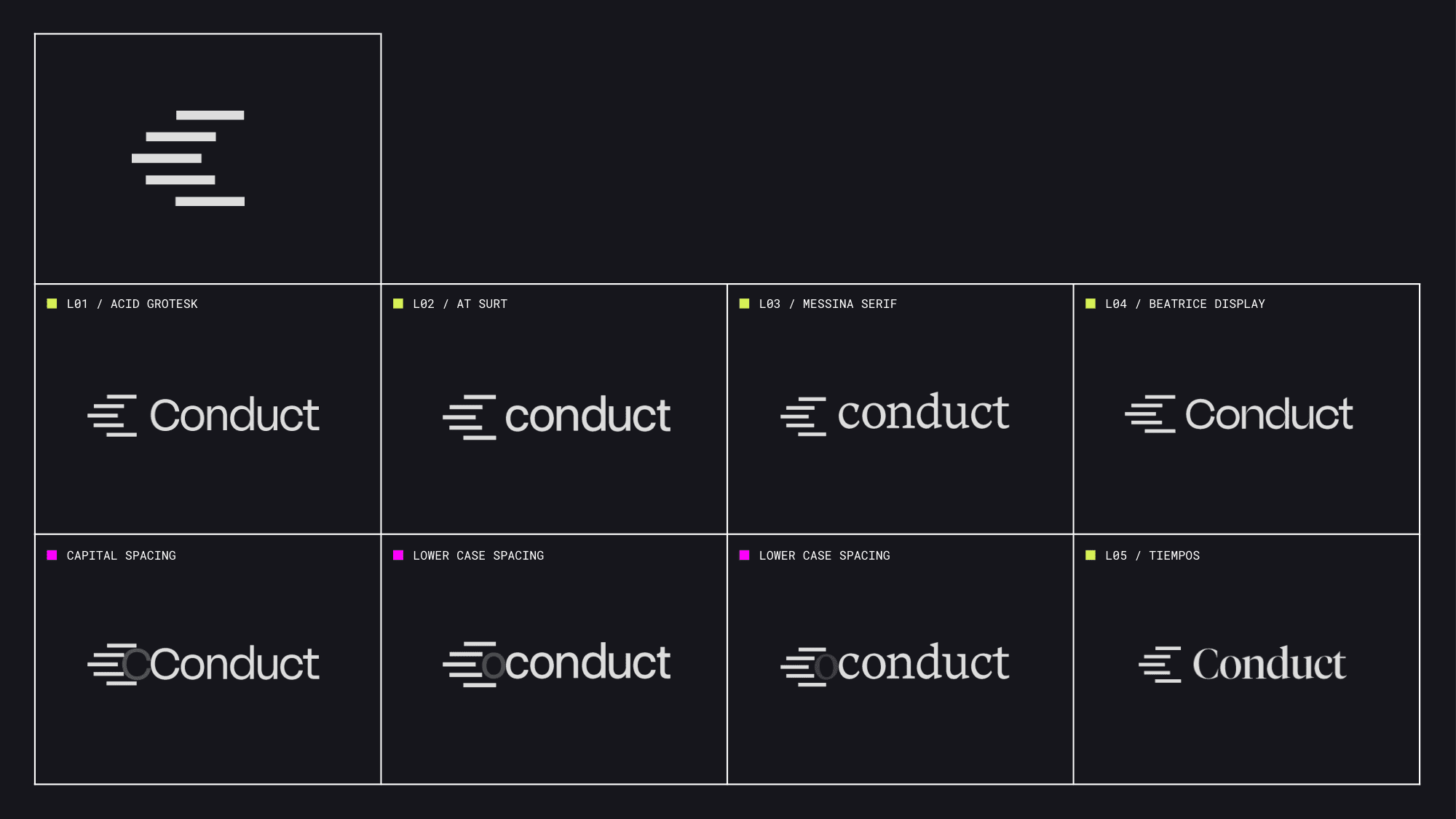
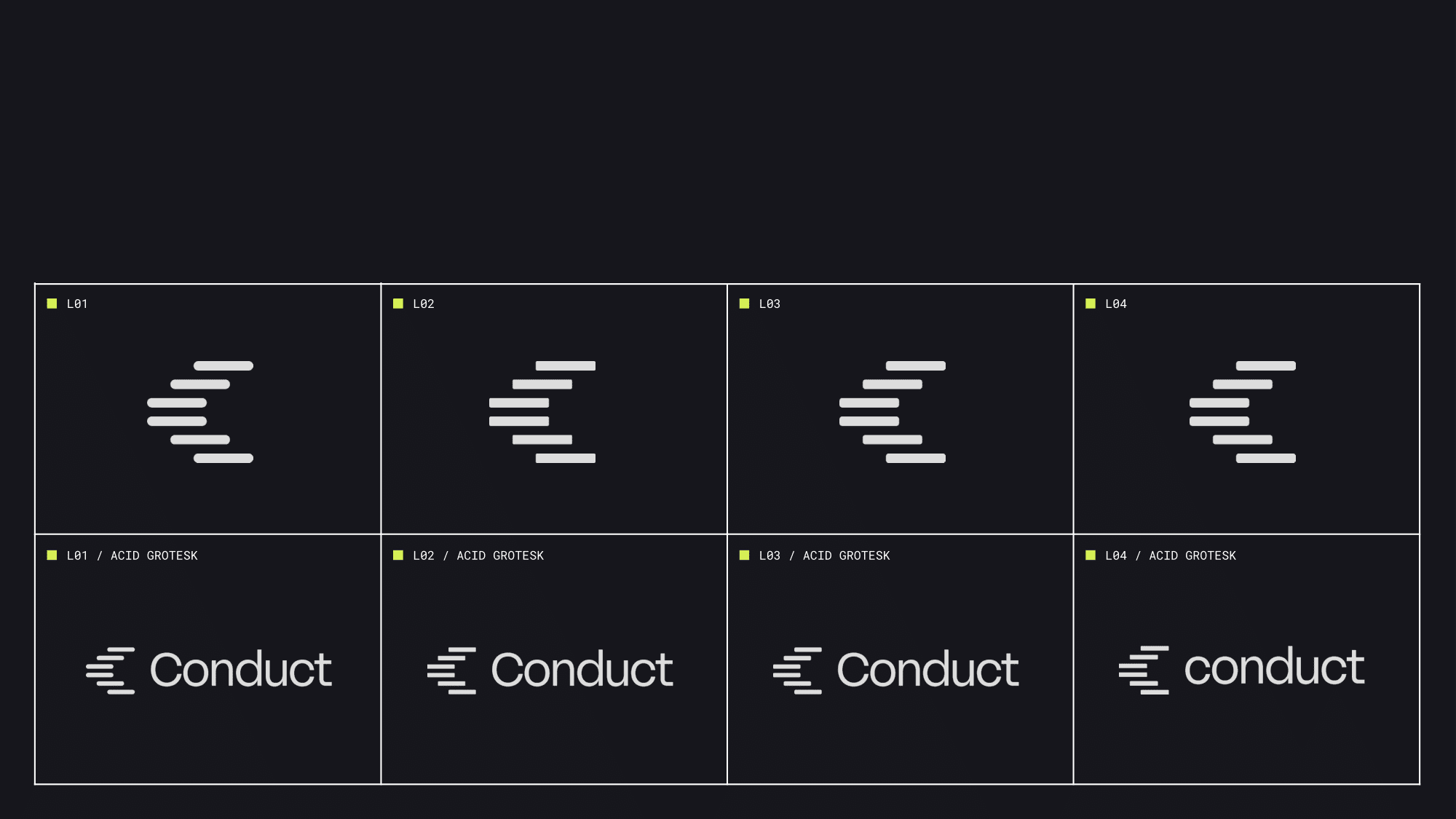
Every decision carries weight. The geometry of the letters, the relationship between angles and curves, the tone a typeface conveys before a word is even read. Designers obsess over the micro — the tension between roundness and rigidity, the balance between optical weight and negative space. Every pixel, line, and radius must feel intentional, even if the viewer never consciously notices.
Then comes the question of tone. Should the identity whisper or declare? Should it feel engineered, human, or ethereal? The designer moves between logic and instinct, between grids and gut feeling, until the mark begins to speak in the brand’s voice without saying a word.
Collaboration is crucial. The best outcomes emerge from a conversation, not a handoff. A client brings depth and conviction; the designer brings the ability to translate it into a universal visual language. The process is iterative — a loop of exploration, critique, and refinement — until something clicks. The right logo doesn’t shout for attention; it simply feels inevitable.
Because at its best, design is not invention. It’s discovery. It’s the moment when form finds meaning — and you realise the mark you’ve drawn isn’t just a symbol for the brand, but a reflection of the way it thinks.


